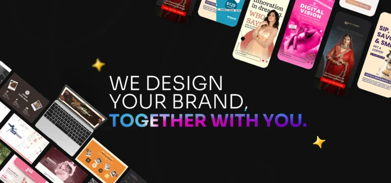
Imagine this.
You’re standing in a supermarket aisle, list in hand, slightly tired after a long day. Shelves stretch endlessly in front of you—rows of bottles, boxes, jars, and pouches all competing for your attention. You weren’t planning to switch brands… but then something catches your eye.
A label.
Not loud. Not chaotic. Just… right.
It feels like it gets you. Before you read a single word, you already trust it.
That moment—right there—is where label design does its magic.
Your Label Is the First Hello
Think of your product label like meeting someone for the first time.
Before they speak, you notice their posture, their clothes, their energy. You instinctively decide whether they feel trustworthy, premium, friendly, or forgettable. Products work the same way.
Your label is your brand’s first hello.
It introduces who you are, what you stand for, and whether you’re worth picking up—all in a few seconds. In today’s crowded consumer market, that first impression isn’t optional. It’s everything.
At WeMagical, we often say:
A label doesn’t just wrap a product. It wraps a promise.
When Great Products Go Unnoticed
We once worked with a passionate food startup. Incredible recipe. Clean ingredients. Loyal customers who tried it. But on the shelf? It disappeared.
Their label was doing what many labels do—it was trying to say everything at once. Too many fonts. Too much information. No clear focal point.
When we redesigned it, we didn’t just “make it prettier.”
We asked human questions:
- Who is this product talking to?
- How should it make them feel?
- What should they notice first?
The result? A cleaner layout, confident typography, and colors that matched the brand’s personality. Within weeks of launch, the product didn’t just sit on shelves—it stood out.
That’s the power of intentional label design.
The Quiet Psychology Behind Every Label
Good label design feels effortless—but behind it is psychology.
Typography sets the tone.
A bold sans-serif feels modern and confident. A serif font whispers tradition and trust. Handwritten styles feel personal, almost homemade.
Color triggers emotion.
Green reassures us something is natural. Black suggests luxury. Soft neutrals feel calm and premium. Loud colors shout for attention—but only work when used wisely.
Layout guides the eye.
Your brain wants clarity. Brand name first. Product name second. Key benefit next. When a label respects how humans read, it feels comfortable—even familiar.
When all these elements work together, your label doesn’t ask for attention.
It earns it.
Labels Don’t Just Compete on Shelves Anymore
Here’s the thing many brands forget.
Your label isn’t only fighting for attention in stores. It’s also competing on:
- Instagram feeds
- Amazon thumbnails
- Website product grids
- Influencer unboxings
If your label doesn’t look good at thumbnail size, it loses half its power.
That’s why modern label design must be both physical and digital-first. It needs contrast, clarity, and confidence—no matter the screen or shelf.
Creativity Meets Compliance (Without Killing the Soul)
For food, cosmetics, supplements, and beverages, labels come with rules. Ingredients. Warnings. Barcodes. Legal text.
And yes—it can feel restrictive.
But the best labels don’t treat compliance as a burden. They design around it. They organize information so it feels calm, not cluttered. They let the brand story breathe without hiding what matters.
When done right, even regulated labels can feel beautiful.
Trends Are Changing—but Clarity Always Wins
Right now, we’re seeing brands lean into:
- Minimalism with purpose
- Sustainable, eco-conscious aesthetics
- Bold typography-led designs
- Premium finishes that invite touch
But trends come and go.
What never goes out of style?
Labels that feel honest, clear, and human.
Why Professional Label Design Changes Everything
Many brands start with DIY tools. And that’s okay—for a while.
But as soon as you want to scale, enter new markets, or command premium pricing, your label must work harder. It needs strategy. Experience. A deep understanding of consumer behavior.
That’s where professional label design stops being a cost—and becomes an investment.
At WeMagical, we don’t design labels to “look nice.”
We design them to:
- Tell your brand story instantly
- Build trust without words
- Differentiate you in crowded categories
- Support long-term growth
Every label becomes a silent salesperson—working day and night.
Your Label Is Always Speaking. What Is It Saying?
Your product might be amazing.
Your ingredients might be superior.
Your mission might be powerful.
But if your label doesn’t reflect that… customers may never find out.
So ask yourself:
- Does my label feel like my brand?
- Would I pick this up if I were seeing it for the first time?
- Does it make a promise I’m proud to keep?
Because in the end, label design isn’t just about packaging.
It’s about connection.
And when your label connects—sales follow.